Maps: Modeling Earth's Surface
Maps As Models
Whether or not you realize it, we use models almost every day. That is especially true in the sciences. One of the most commonly used models is a map. As with all other models, a map must be:
Together, these features make your map useful. These handy little drawings, whether on your smartphone or good old-fashioned paper, have been helping people get around and understand their world since the early days of civilization.
Maps are really important. You probably know that if you’ve ever been lost or just never bothered to learn how to get around because your smartphone will tell you where to go. From this very practical perspective, maps tell us where to go, how to get there, and (on a good map) what sort of challenges you may face along the way, like a giant mountain or a traffic jam.
Maps are also important in a more philosophical sense. Today, we have the advantage of global positioning satellites and astronauts in space to give us a full view of the Earth from above, so we can be quite certain what the Earth looks like. But, this wasn’t always the case, and especially back before the days of worldwide airplane travel when people can actually go see the rest of the world for themselves, people’s worldview was largely shaped by the maps they had at their disposal. And, those maps were limited by the vantage point of the people who created them, down on the ground and unable to travel particularly far. That’s why misconceptions like “the world is flat” or “our country is the center of everything” stuck around for so long. Science matters, guys.
Maps are also mostly wrong. Just like our models of the atom are great and useful and important, they are ultimately just that—models. If you think you know what the world looks like based on flat maps, check out this video for a new perspective:
- Accurate. The map must correctly show where something is located relative to other things.
- Drawn to scale. The distances between things on the map should reflect the actual distances. For example, 1 inch on the map might equal 1 mile in real life. This requires a little bit of math (ratios) to figure out, but it is what makes the map accurate.
Together, these features make your map useful. These handy little drawings, whether on your smartphone or good old-fashioned paper, have been helping people get around and understand their world since the early days of civilization.
Maps are really important. You probably know that if you’ve ever been lost or just never bothered to learn how to get around because your smartphone will tell you where to go. From this very practical perspective, maps tell us where to go, how to get there, and (on a good map) what sort of challenges you may face along the way, like a giant mountain or a traffic jam.
Maps are also important in a more philosophical sense. Today, we have the advantage of global positioning satellites and astronauts in space to give us a full view of the Earth from above, so we can be quite certain what the Earth looks like. But, this wasn’t always the case, and especially back before the days of worldwide airplane travel when people can actually go see the rest of the world for themselves, people’s worldview was largely shaped by the maps they had at their disposal. And, those maps were limited by the vantage point of the people who created them, down on the ground and unable to travel particularly far. That’s why misconceptions like “the world is flat” or “our country is the center of everything” stuck around for so long. Science matters, guys.
Maps are also mostly wrong. Just like our models of the atom are great and useful and important, they are ultimately just that—models. If you think you know what the world looks like based on flat maps, check out this video for a new perspective:
Why Are Maps Wrong?
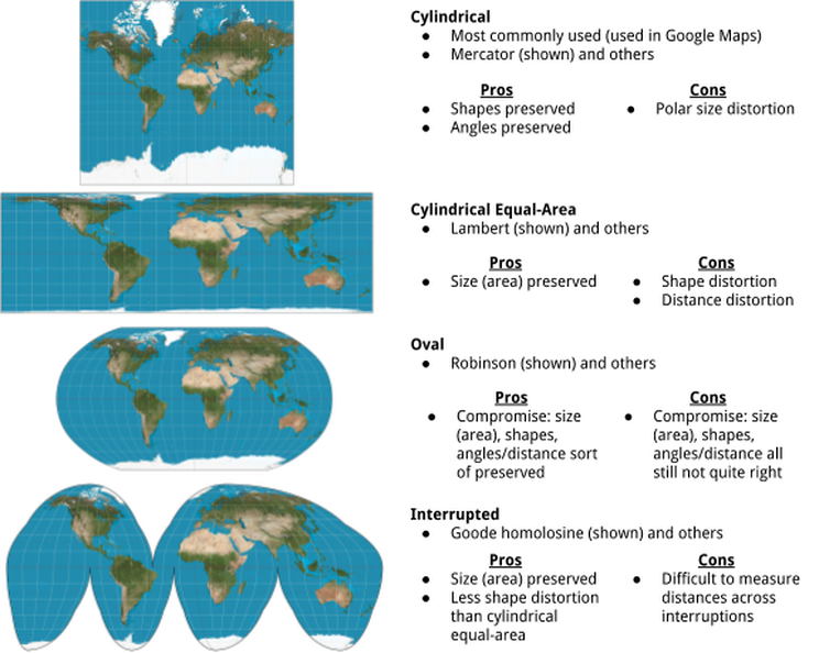
Even with our luxury of being able to see the world perfectly from space, it is impossible to translate a spherical map onto a flat piece of paper without some distortion. Most maps that you’ve ever seen make the northernmost and southernmost bits of the world look a lot bigger than they actually are. This is called polar distortion or polar size distortion. From a political perspective, this is a problem because it just so happens that most political and economic power is situated in the North (Europe, North America, much of Asia), whereas the less economically-sound places like Africa and South America are closer to the equator. So, it seems political (and rude) to make their countries/continents smaller on a map than they actually are in comparison to the rest of the world.
Many have tried to solve this important geometrical problem with better maps. These are the most common shapes of maps, along with their pros and cons:
Many have tried to solve this important geometrical problem with better maps. These are the most common shapes of maps, along with their pros and cons:
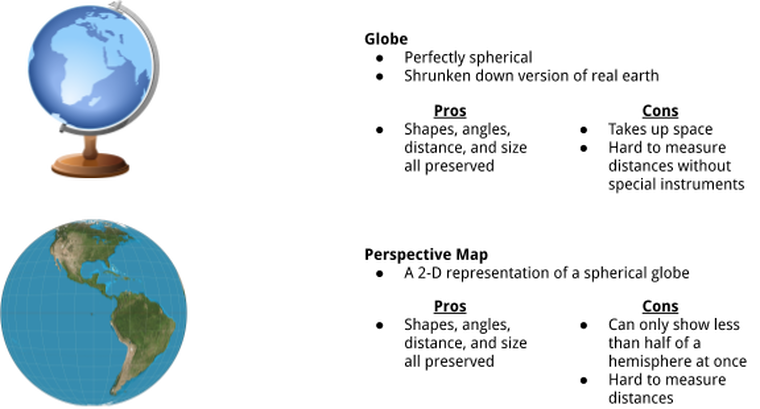
Naturally, the best solution to all of these problems is to use a globe. But, that’s still not perfect.
What's the Use in Maps if They're All Wrong?
Despite all of the flaws in maps, and even though one map will never be a perfect representation of everything we could possible want to know about the world (after all, the world is big and complicated and has a lot of things going on in it), maps are still really useful. They convey the most important information that we want out of our map, whether that’s where a country’s borders are, where I can anticipate hills along a hiking trail, where I can find the nearest lake, how long it’ll take me to get home in traffic, and so on. It all just depends on the type of map you choose to use.
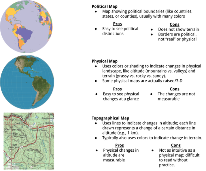
Here are some common examples:
Here are some common examples:
There are also maps that show other things. Some examples include economic maps, climate maps, resource maps, road maps, and traffic maps. Each shows the information that will be important to the person who chooses to use that map, and each will have other flaws because, after all, nobody’s perfect.
Summary
At the end of the day, all of these maps are just models. They are smaller versions of the real world, and that’s what makes it important to draw them correctly.
You should understand:
You should understand:
- That maps are imperfect models and that there are pros and cons to every model of the Earth
- That the usefulness of a map relies on it being accurate and drawn to scale.
- The unique features of political, physical, and topographical maps.
Learning Activity
Content contributors: Emma Moulton


